Work at GalleyCase study
Menu Plan & Company Settings
Two redesigns with one question behind them: where does a setting live, and whose is it? First the page where kitchen teams plan their menus, then the settings their admins configure Galley with.
- Role
- Director of Product. I researched, designed and built both, with Claude Code
- Timeline
- September to November 2026
- Used by
- Executive chefs, dietitians and directors planning menus; admins setting Galley up
- Status
- Menu Plan view in Beta, Company Settings in Alpha (November 19, 2026)
TL;DR
The problem
The menu plan page had grown one control at a time: two rows of chrome, 16 expand and collapse options in three menus, and display settings saved on each plan, so one person's change was everyone's. Behind it, the admin settings had up to 21 tabs wrapping into a wall of words.What I did
I counted how people used the page before cutting anything, redesigned the header in the running app until each row answered one question, moved display settings to the person, then gave every module one settings page.The result
One Expand control instead of 16 options, a header that folds to one line, view settings that follow the person, and settings where nothing points elsewhere. Both are in early access.
The problem: settings with no clear home
Galley runs the back office of professional kitchens, mostly contract food service: hospitals, senior living, schools, corporate dining. Menu Plan is where a kitchen plans what it will serve for weeks ahead: events like Breakfast and Lunch, groups like Entrées, items that are recipes, with headcount, cost and price rolled up. Executive chefs build the plans, dietitians check every item, directors watch cost.
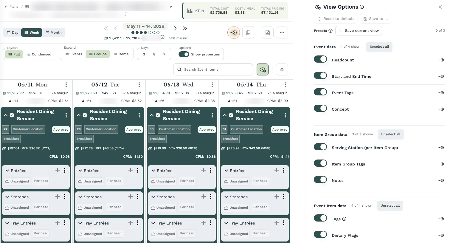
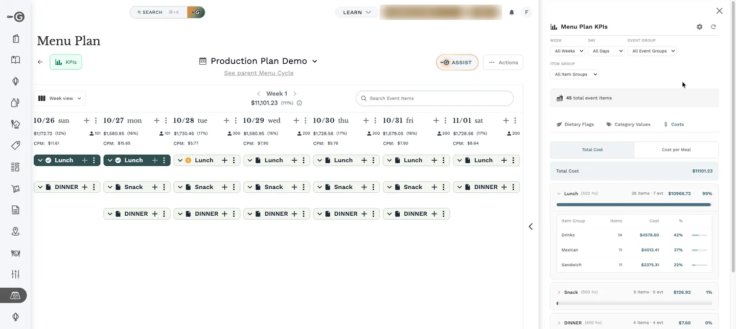
The page had grown one control at a time: a big title, a KPI box wedged between buttons, a dropdown mixing periods with layouts, and two rows of controls saying the same kind of thing. Expanding and collapsing the grid was spread over 16 options in three menus. Thirty days of click data showed every click used the same scope and several options were never used, and the deepest one was the page's top crash trigger on large plans. Those menus came from my own 2024 spec.
What a plan showed (cost, pricing, tags, notes) was saved on each plan. A manager hiding cost before a client meeting hid it for purchasing and the dietitian too, and an executive chef with 30 menu cycles set the same switch 30 times.
Behind the plan, the admin area could show up to 21 tabs, each gated by permissions or modules, wrapping onto two to four rows that differed from one admin to the next. Settings were filed by kind rather than subject, so admins looking for a module's options did not find them.
My role
I owned both problems and wrote every design document, each hardened in three or four devil's-advocate rounds. Before deciding, I looked at production data: click and crash data for the expand menus, and read-only load tests on large plans.
I designed the interface by iterating in the running app, one instruction at a time, and built it with Claude Code. Other engineers shipped features inside the same screens, and the CEO designed the Features and views hub that my settings work later replaced. The redesigns are mine; the modules are the team's.
Constraints
- Kitchens plan real meals on this page every day, so both redesigns shipped behind flags that left the old version untouched. For settings, I captured every old page with the flag off and compared them before Alpha.
- Plans and menu cycles share the page, so cycles had to reach the same design (they got it two weeks later, in one change).
- Hiding is not security. A setting that hides cost from a role must never be read as protecting it, and the product's words had to say so.
- The switches model in settings was the CEO's approved design, so changing it meant amending his decisions, with his agreement.
Four decisions that shaped it
Decision 1
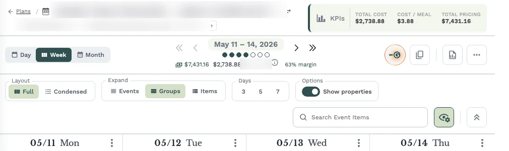
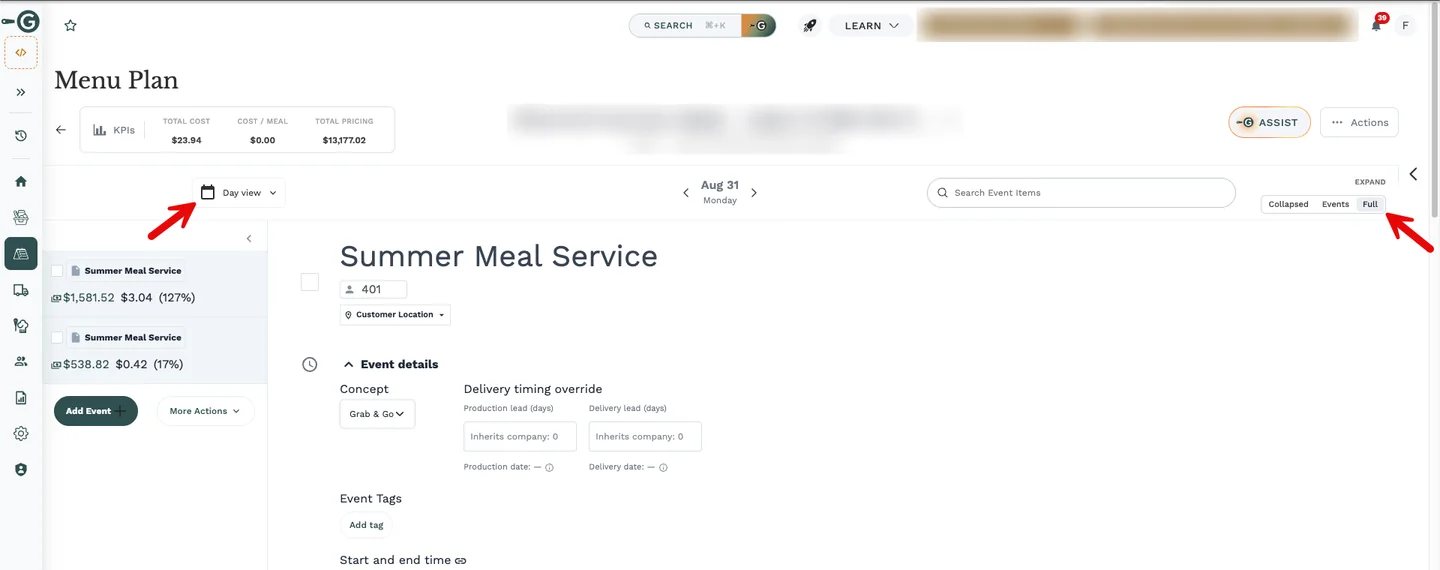
One Expand control instead of 16 options
Expanding and collapsing the plan grid lived in 16 options across three menus, specified by me in 2024. Usage showed one scope used every time, several options never clicked, and the deepest option freezing large plans.
Options
- Keep the scopes and drop the level split.
- Remove bulk expand entirely.
- Add an automatic default.
- One ordered control per view: Events, Groups, Items.
What I chose
One ordered control per view, remembered per view, with Full as the default where it is cheap (Day and Month). When a customer later asked to open one event across the whole week, that became a single item in the event's menu.
- Why
- People used the depth choice and never the scope choice, and making each step reversible fixed five places where expand and collapse were not each other's opposite.
- What it cost
- The control needed a home the old header could not give it, so a one-control ticket became a header redesign. Month and the condensed layout shipped without it.
- What I said no to
- An automatic default (the data showed it would open almost every group anyway), and removing bulk expand, which was still in regular use.
Before
After
Try the Menu Plan, before and after
Do each task in both versions. The clicks are counted for you, and "Show me how" points the way.
Task 1Show every item in Tuesday's Lunch.
Before: not tried yetAfter: not tried yet
Task 2Hide costs before a client meeting, while the dietitian still sees them.
Before: not tried yetAfter: not tried yet
The real screens. Click anywhere to see what you can click, and scroll where the app scrolls.
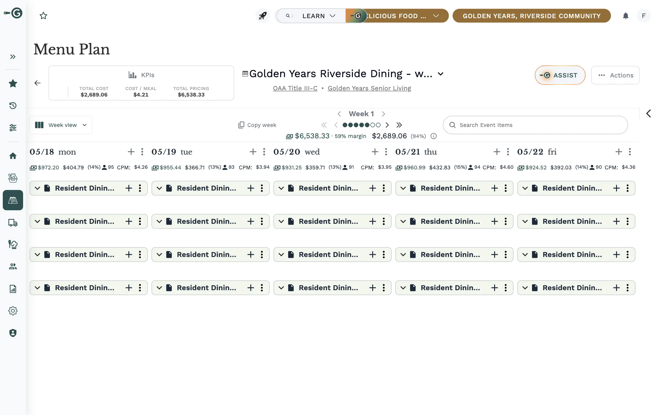
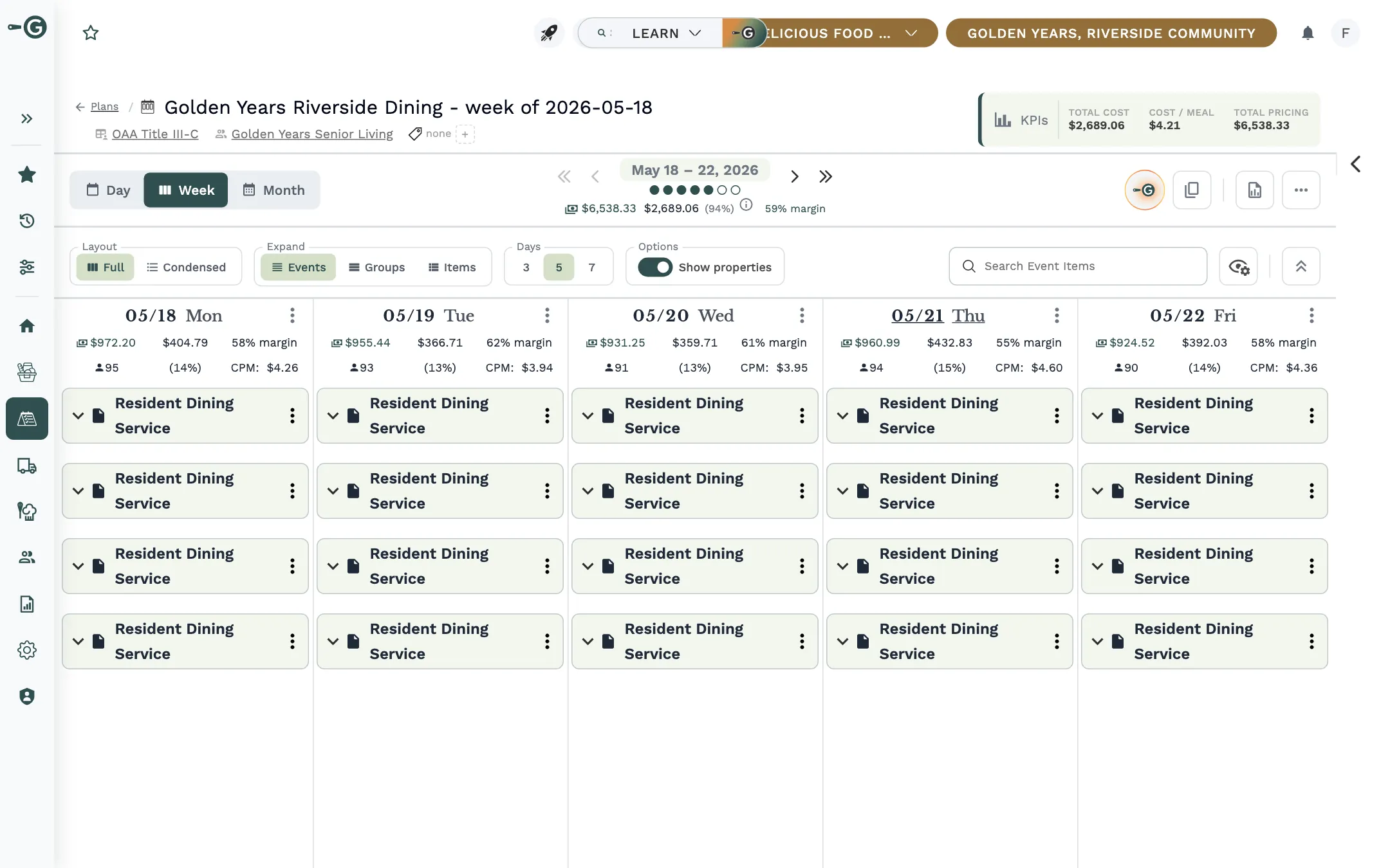
Captured from Galley in November 2026 with its demo company, Delicious Food for Everyone: the old version with the redesign switched off, the new one with it on. Every clickable area is the real control; screens the tasks do not need are left out.
Decision 2
A three-row header, one question per row
The header mixed reading, navigating and configuring; the plan name, the KPIs and the pickers fought for width.
Options
- Put Expand beside the period picker in the old header.
- Segmented pills borrowed from the events schedule page.
- Everything on one row.
- A collapsible band of view options.
What I chose
Three rows: who (plan name, tags, KPIs), what you are looking at and what you can do (Day, Week or Month, the period, the tools), and how it is drawn (layout, expand, days, options). Row three holds settings only, nothing that writes and nothing that navigates, and the header folds to one line.
- Why
- Each row reads as one thing, the period picker can sit in the centre, and the KPI box, the only thing read rather than clicked, goes last. Folded, the header gives back about 175 pixels of grid.
- What it cost
- Tools became icon buttons with names on hover, going from 330 to 160 pixels wide, and that hurt discovery: people missed the fold button, so I redid it as a clearer double arrow. The first-visit tour also opened too often and had to be rebuilt around triggers, with "Show me later".
- What I said no to
- A single row ("TOO crowded", my note on that round), the KPIs beside the Actions button, and an off-centre week picker.
Decision 3
Display settings belong to the person, not the plan
In August I shipped the opposite model myself: display values copied onto each plan when it was created, with a reset. Within weeks its side effects showed. One person's change was everyone's, the same switch had to be set on every plan, and a new company default never reached older plans.
Options
- Keep per-plan values as an override on top of the person's.
- One primary role per person.
- A separate profile settings page.
What I chose
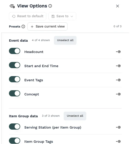
Each person's own view, starting from their roles' defaults or the company's. Admins can mark a role or the company as Blocked, so people can see less but never more. The few settings that change data, such as budgets per event, stay on the plan.
- Why
- A presentation preference belongs to the person looking, not to the thing being looked at. Galley's settings standard now encodes the split: behaviour is copied onto the record, presentation is not.
- What it cost
- Existing per-plan values were dropped rather than migrated, after reviewing them first. And a permanent caveat: this is not access control, so no copy may promise that cost is private.
- What I said no to
- A per-plan override layer, hiding limited rows (they show locked, with the reason), and a diagnosis screen.
Decision 4
Company Settings organised by module, with one role picker
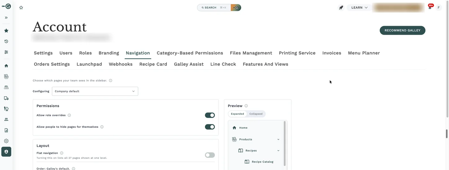
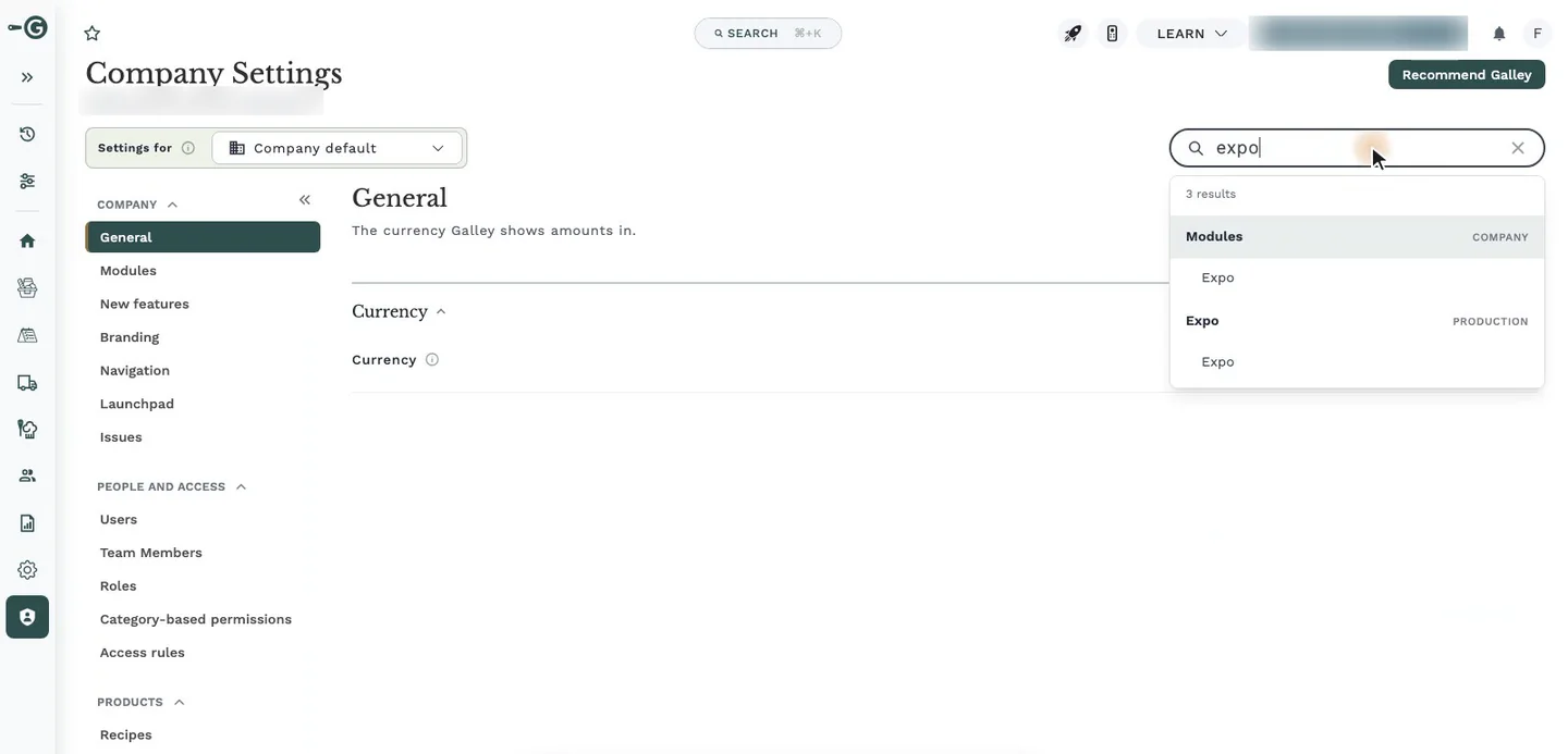
My first settings release replaced the wrapping tabs with a grouped side menu and a search that jumps to any setting. Alpha testers then hit the deeper problem: settings were filed by kind in two places, a Features and views hub and each module's page, and they could not tell which held what. My first fix, rows saying "Set in Features and views", needed 16 of them across 7 pages.
Options
- Keep sorting by kind and tidy the pointers.
- A role picker on every page.
- A separate "module in use" setting beside the switches.
- Keep the Features and views hub for roles.
What I chose
Every setting about a module moved to that module's page. One "Settings for" picker at the top applies to every page, with a preview that shows the app as a chosen role. A whole module became a switch, using the same tool as its parts: "we could even expand the Switch tool to disable a whole module, so we don't need to create a second entity".
- Why
- Admins look by module, and one audience choice made once beats one per page. Two scenarios had to work: a module on for the company but hidden from line cooks, and a module off for the company but on for planners.
- What it cost
- It retired a hub the CEO had shipped three weeks earlier and amended seven of his approved decisions, which needed his agreement. It shipped as one large change, guarded by keeping every old page as a flag-off copy. And hiding a module is easy to misread as security, so the module card says it is not.
- What I said no to
- A picker per page, a second "module" entity, keeping the hub, and a "classic tabs" switch for the old layout.
Before
After
Try Company Settings, before and after
Do each task in both versions. The clicks are counted for you, and "Show me how" points the way.
Task 1Find the setting that turns Menu Planner KPIs on or off.
Before: not tried yetAfter: not tried yet
Task 2Hide the Purchasing module from Line Cooks.
Before: not tried yetAfter: not tried yet
The real screens. Click anywhere to see what you can click, and scroll where the app scrolls.
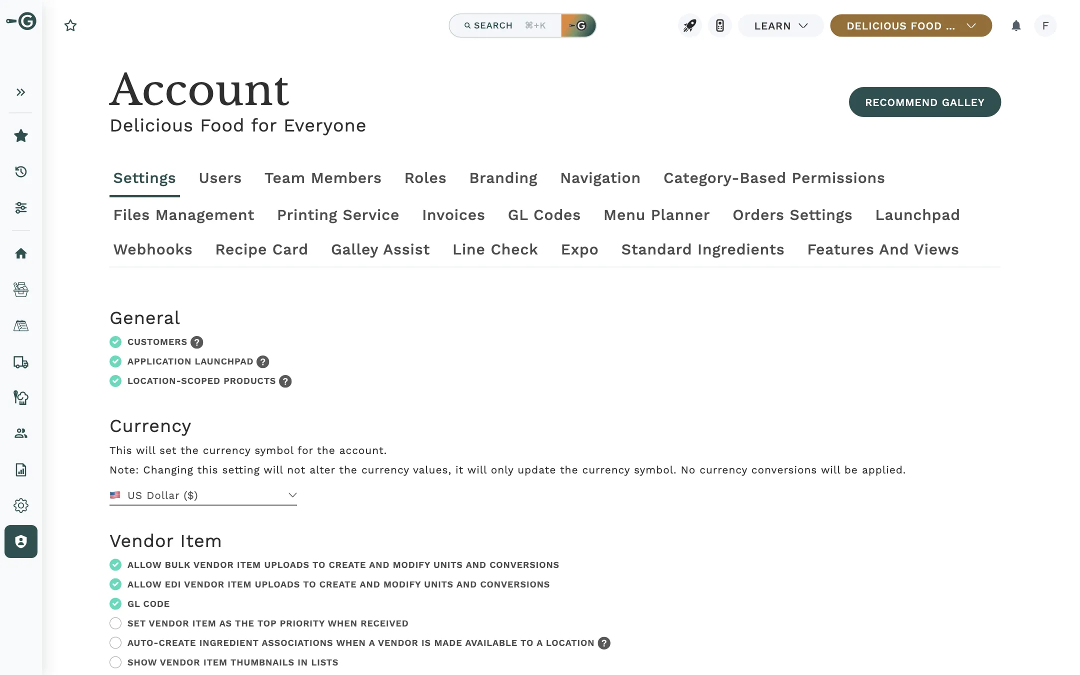
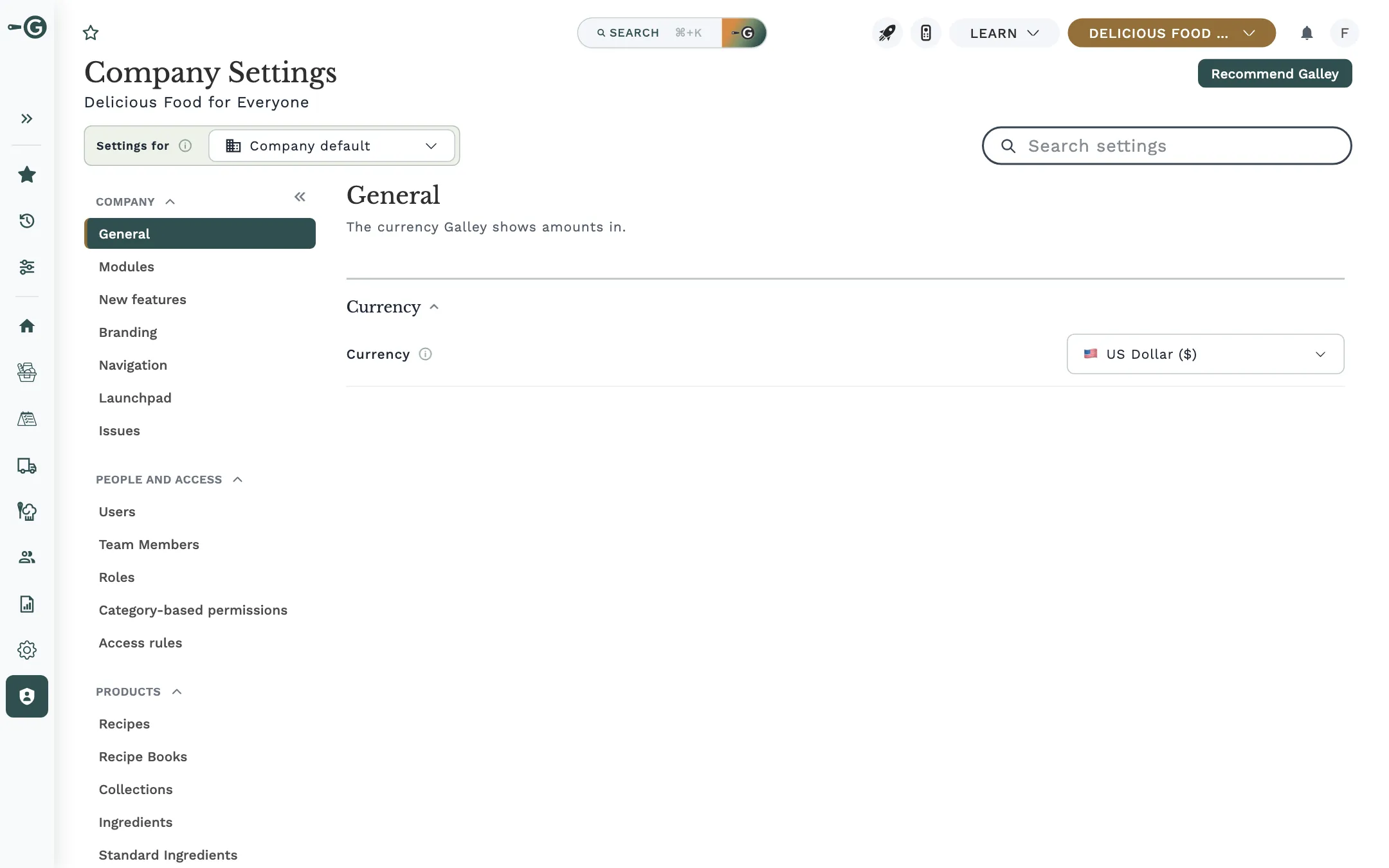
Captured from Galley in November 2026 with its demo company, Delicious Food for Everyone: the old version with the redesign switched off, the new one with it on. Every clickable area is the real control; screens the tasks do not need are left out.
How it came together
I designed both acts in the running app rather than in mockups. For the header, that was a week of rounds, each a direct instruction from a screenshot: move this picker, borrow that pattern, this row is too crowded. For settings, a working prototype on a fake backend went through nine test rounds in five days before the real build.
A leadership review of the new plan view on September 23 produced six changes, from view settings that follow a person across plans to shareable view links and a first-visit tour; they shipped together twelve days later.
Both shipped through Galley's own Feature Control: Alpha with a narrated demo video and a kickoff, Alpha feedback triaged into tickets the same day, and usage tracking on every view, layout, tool and settings search, so the next decisions can be counted too.
Outcome
As of November 19, 2026. Both redesigns are in early access, so this is what shipped and how it was tested; adoption numbers come after general release.
16 to 1
expand and collapse options, replaced by one control per view
175 px
of grid given back when the new header is folded to one line
21
tabs the old Account page could show, now one grouped menu with search
16 to 0
rows pointing to settings elsewhere, once every setting moved to its module
49
entries in the placement map that gives every setting one home
9
rounds of prototype testing in 5 days before the settings build
What I do not know yet is whether people find settings faster. The plan is to time common tasks from the side menu, aiming for each under 30 seconds, and the tracking is in place; the numbers come once both reach general release.
What I learned
Count before you cut
The expand menus looked like a design problem. The click data showed mostly unused scope and one dangerous action, which made the cut easy to defend, even against my own 2024 spec.
Presentation belongs to the viewer, behaviour to the record
I shipped per-plan display settings in August and replaced them with per-person ones in October, once the side effects showed. The settings standard now encodes the split.
A hub on top of module pages creates a second home
Alpha testers could not tell which page held what. Pointer rows lasted a day; the fix was removing the hub, not adding signposts.
"Flag off" has to be audited, not declared
My first plan-view build changed about fourteen files outside its flag. For settings, I kept every old page as a flag-off copy and compared screenshots before Alpha.
Hidden controls do not get found, and tours should not nag
The icon-only fold button was missed, and the first tour opened on almost every visit. Both were rebuilt within weeks.
Hiding is not security, and the copy has to say so
Both acts state it in the product and in the release notes, because a hidden cost column reads like a private one.
Talk to me about it
Both redesigns live inside Galley's product, so there is no public demo. I am happy to walk through the iterations in a conversation.